Worldpay POS
CLIENT
Worldpay
My rolE
UX Design
UI Design
User interviews
Competitor analysis
―
Worldpay POS is an iOS and Android native app aimed at SMB merchants which offers an easy way to create a digital catalogue of products and start taking card payments straight away.
The app also includes the capability to track your day-to-day sales as an all-in-one solution for busy shop owners.
Reusable components
One of the first things I worked on when I joined the project was to organise and build a design system based on the existing apps.
As the only designer at the time, I had to prepare the Sketch files for 2 more UX/UI designers joining shortly.
The Design system and re-usable files proved very useful in the months to come because there was a big rebrand exercise and the design system made this a much smoother transition.
feature ideation
Some of the features I designed and user tested were:
What’s new pop up (showing the user what are the big changes introduced in this app update)
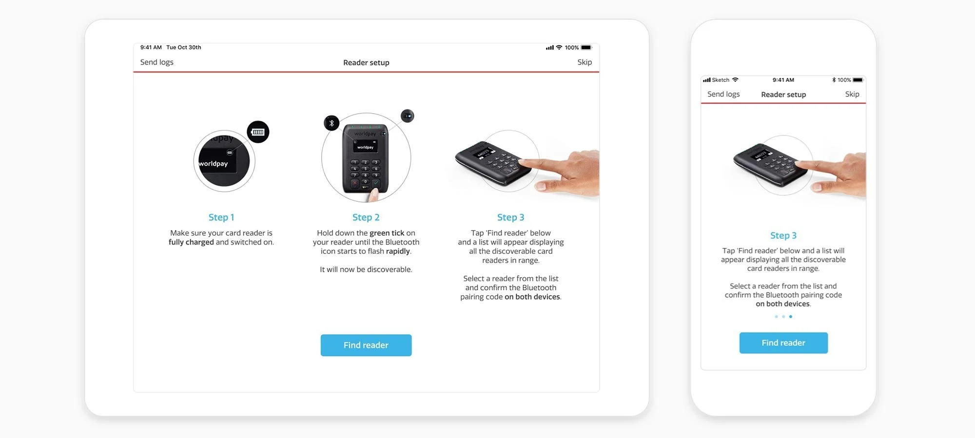
Reader vs Hub proposition (helping Android users set up their machine with the correct settings)
Multi-basket feature on Android
Ability to add Tips to a transaction
Ability to add Discounts to a transaction
Printer functionality
SDK Sample apps (aimed at developers)
Brand refresh
Before
After
A major release happened in the 2nd year of this project, when the corporation had a significant rebrand and our design team was asked to change the logo and colour palette of the apps.
We took the opportunity to make some major UI and UX improvements, such as increasing the readability of the item names and simplifying the colours - in order to make the most important items stand out.
Print functionality & receipts
I was able to design the experience of issuing and printing receipts, this was a very important feature that most of our users were asking for. It had to be intuitive for users who are potentially using the app for the first time (with minimal training) and also time saving for all of our power-users for whom an extra second would be too long to wait.
App Store images
I also worked on the new app store images which showcased the newly rebranded app and the company messaging.


